In regards to multimedia design, coherence refers to a hurtful addition of multimedia elements (Clark & Mayer, 2011, p. 151). Clark & Mayer outline two Coherence Principles that are intended to guide multimedia designers to only use pertinent elements when creating products. Below, I show a an example and a non-example of coherence in multimedia design.
Coherence Principle #1
|
Coherence Principle #1 states that we should "avoid e-lessons
with extraneous audio" (Clark & Mayer, 2011, p. 153). While it houses many lessons, PBS Kids is a non-example of Coherence Principle #1. More than once, I have tried inconspicuously pulling the website up while students were quietly finishing another assignment. Forgetting to mute the volume, the site never fails to excite and distract when it is loaded. The sounds are engaging and informational, but in this case extraneous. This seems to happen as you navigate to most pages in the site. |

|
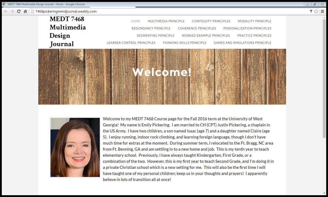
Coherence Principle #2
|
Coherence Principle #2 states that we should "avoid e-lessons
with extraneous graphics" (Clark & Mayer, 2011, p. 159). If I may be so audacious as to say so, the home page for this MMD Journal is a positive example of Coherence Principle #2. In past websites and publications, much to my husband's chagrin, I have "cutsied it up" and used too much clipart. Such a home page as this site's in the past would have had frog clipart to represent my class theme, red things to represent my favorite color, etc. However, for the sake of clearly, succinctly communicating to viewers of this site a bit about the author and navigation, I have used only a small picture of myself. The picture in the header is consistent throughout other pages in the site, adhering to the Gestalt Theory component of similarity in visual literacy. |
|
Coherence Principle #3
|
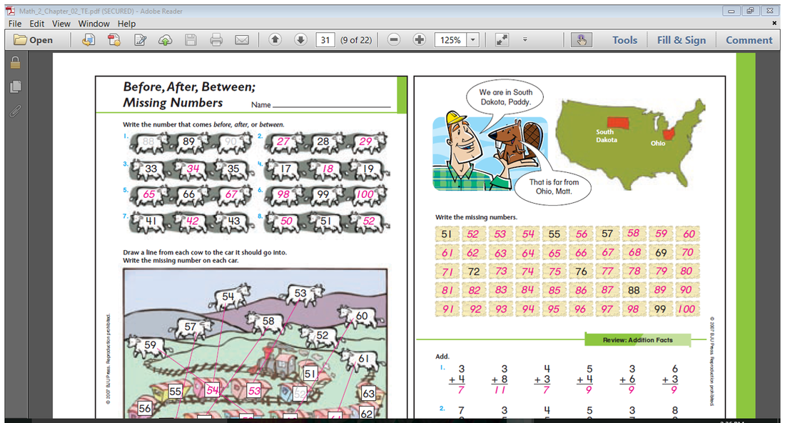
Coherence Principle #3 states that we should "avoid e-lessons with extraneous words" (Clark & Mayer, 2011, p. 166). At right, I have shown a non-example of this principle. This past week, I taught my students about using place value to order numbers. The textbook's characters are shown with a US map highlighting the state they were from and the state to which they were traveling. As it is impossible to read exactly from the scripted lesson and have time to truly teach the content, I started my lesson differently than the author's intended. This resulted in Matt & Paddy becoming a distraction, instigating a 5 minute tangent on the different places we were born and had lived in our highly-mobile military and medical community. The extraneous dialogue between our beloved characters did not contribute to Math content.
|
|
References
Clark, R. C., & Mayer, R. E. (2011). E-learning and the science of instruction: Proven guidelines for consumers and designers of multimedia learning. San Francisco: Pfeiffer.
